
#rescuethatfrog
#rescuethatfrog
Today, March 23, is World Meteorological Day! Check out the website to see what the world’s meteorologists have observed about our changing climate.

In honor of World Meteorogical Day, the World Meteorological Organization (WMO) released its annual Statement on the State of the Global Climate for 2016. This report is a yearly product obtained by combining weather and climatic data from multiple independently operated global climate centers to create a “snapshot” of Earth’s weather for the year. On Tuesday, WMO released a summary of highlights from 2016 under the headline, “Climate breaks multiple records in 2016, with global impacts.” Check it out.
Last Thursday, when asked at a press conference about the elimination of climate funding (even to monitor it) in the President’s March 16 federal budget proposal, Mick Mulvaney, head of the President’s Office of Management and Budget, had this to say: “We’re not spending money on that anymore; we consider that to be a waste of your money to go out and do that.” (See video).
Here are a few things the world’s climate experts said about the 2016 WMO report (The Guardian, March 21):
“The need for concerted action on climate change has never been so stark nor the stakes so high.” (Prof. David Reay, emissions expert, University of Edinburgh)
“Earth is a planet in upheaval due to human-caused changes in the atmosphere. In general, drastically changing conditions do not help civilisation, which thrives on stability.” (Jeffrey Kargel, glaciologist, University of Arizona)
“Our children and grandchildren will look back on the climate deniers and ask how they could have sacrificed the planet for the sake of cheap fossil energy, when the cost of inaction exceeds the cost of a transition to a low-carbon economy.” (Sir Robert Watson, climate scientist at the University of East Anglia and former head of the UN climate science panel)
Read more about the President’s federal budget proposal here, and consider taking action to influence Congress to pass a budget more considerate of our children’s futures.
#AskYourDenierIfTheyveSeenThis
#rescuethatfrog
In Episode 4 of my history of evidence related to Global Climate Change, I wrote about the Keeling Curve, a continuous record of the global atmospheric CO2 concentration that has been measured on the side of a volcano at Mauna Loa, Hawaii from 1958 to today:

The blue data above is crucial to our understanding of humanity’s effect on our planet. It shows us clearly that the atmospheric CO2 concentration has increased by 40% since 1900. Meanwhile, the global average temperature has increased by 1.1 degrees Celsius since 1880. These two facts confirm calculations performed in 1956 by physicist Gilbert Plass (1956a, 1956b, 1956c, 1956d), that continued CO2 emissions from fossil fuel combustion in the second half of the 20th century would lead to a temperature rise of about 1 degree Celsius by 2000, at which time we would experience readily observable effects of Global Climate Change. (Which we do.)
Given the blue data above and the measured temperature rise almost exactly equal to Plass’s predictions of the expected temperature rise from CO2 emissions, I think it’s pretty wise that we’ve been measuring this stuff. Do you?
An interesting story I didn’t mention in Episode 4 of my history is the fact that, but for the impassioned and persistent advocacy of Dave Keeling and other scientists, as well as timely decisions by individual government administrators at critical points, we could easily not have this data. At multiple times, the Mauna Loa observatory was nearly defunded by changing governmental priorities, as illustrated by the graphic below. You can read more about the continuous need for advocacy to keep the observatory going on the Scripps website or in Dave Keeling’s autobiographical account.

We are experiencing a new need for advocacy now.
Yesterday, President Trump signed into law the NASA Transition Authorization Act of 2017, providing about a $19.5 billion per year budget for NASA (accounting for around 0.5% of the total federal budget). (Read more here.) The new plan for NASA is highly unusual, in that it makes no mention of earth science, including climate change. For most of us, NASA conjures thoughts of moon landings and space exploration. It’s important to know, however, that the study of our own home planet has been a core mission of NASA since its inception.
That is, since NASA’s inception in 1958, the exact same year Dave Keeling and other scientists began CO2 measurements at Mauna Loa. Coincidence? No. Both efforts resulted from the 1957-1958 International Geophysical Year, a global effort to fund basic earth science. In fact, the 1958 law that formed NASA specifically called on it to bring about the “expansion of human knowledge of phenomena in the atmosphere.” Since then, even while it was sending folks to the moon and satellites across the solar system, NASA has executed that core earth-based mission under 6 Republican administrations and 5 Democratic ones. Until now, if President Trump has his way.
On March 16, the President published his proposed federal budget. It is brutal with respect to the global climate. If enacted, the plan would terminate both efforts to reduce American greenhouse gas emissions and diplomatic efforts to lower global emissions. Even more irresponsibly, this budget would defund our efforts to monitor the cimate. Read more here.
NASA’s planned Plankton, Aerosol, Cloud, ocean Ecosystem (PACE), Orbital Carbon Observatory-3 (OCO-3), Deep Space Climate Observatory (DSCOVR), and CLARREO Pathfinder missions would be cut. Each of these satellite based missions is designed to monitor aspects of the earth’s climate, enhance our ability to predict changes, and help us prevent or adapt to those changes.
At the EPA, the President’s budget also would wipe out the Clean Power Plan, our current key policy vehicle for complying with commitments we Americans made at the 2015 Paris Climate Agreement, an agreement signed by 194 nations to limit global warming to “well below 2 degrees Celsius above pre-industrial levels and to pursue efforts to limit the temperature increase to 1.5 degrees Celsius above pre-industrial levels, recognizing that this would significantly reduce the risks and impacts of climate change.” (Basically, to do what scientists say we must in order to avoid massive consequences for the children currently living among us. And the clock’s ticking – we are already up 1.1 degrees as of 2016.)
In the State Department, the President’s budget would eliminate the Global Climate Change Initiative and eliminate all payments to United Nations climate change programs.
When asked about climate funding at a press briefing last Thursday, Mick Mulvaney, head of the President’s Office of Management and Budget, had this to say: “We’re not spending money on that anymore; we consider that to be a waste of your money to go out and do that.” (See video). Take a look at the summary statements of the Intergovernmental Panel on Climate Change reports, which I included at the appropriate time points on the blue graph above. They look increasingly desperate with time, right? In light of those conclusions by a large, international panel of scientists, please consider whether you think climate science is a waste of money.
For me, doing nothing on climate change, in light of the data at the top of this post, would be terrible, as it’s a policy that would put our own children at substantial risk and also cede any moral authority we have in the world. To do that, while at the same time ceasing to even monitor climate change, would be unconscionable. None of us, individually, would make such a decision. This is like texting while driving, trying to get a base hit with your eyes closed, or refusing to check your blood pressure when you know it’s high. We need to, at the very least, watch.
Who benefits from such a myopic policy? Who benefits from not even knowing what’s going on with the atmosphere we are clearly changing? Certainly not the people of Shishmaref (though they have become thought leaders on our problem). Certainly not the people of coastal cities like New Orleans or New York City (for whom Shishmaref is a canary). Presumably, we would prefer to have some warning before the coastal seawater is lapping at our feet.
The only people who would benefit from a policy of not even monitoring the environment are the executives of coal, oil, and gas companies who lack the imagination and courage to transition their enterprises to already-available, more sustainable technologies. Maybe they are building up their trust funds so their kids can move inland to gated communities protected from the deteriorating environment around them. Most of the rest of us have or know children who will need to live in the world as it is on average. On average, as we have seen, it’s getting hotter ever faster.
Fortunately, the President’s budget proposal is (so far) only a proposal. Congress ultimately determines the budget. It needs to be influenced now.
Please join me in encouraging Congress to fund the basic science needed to monitor the changing environment, as well as the planned EPA and State Department activities with which we must meet the Paris Climate Agreement commitments we made along with 194 other nations. There are tools to identify your House Representative and Senators on my Take Action page. Here are some example letters I have written on the budget proposal – feel free to copy if it helps you get some letters out.
#rescuethatfrog
This is the 4th episode in a series recounting the history of measurements and data related to Global Climate Change. If you’re just joining, you can catch up on the previous episodes:
Episode 4
In 1953, Charles David (“Dave”) Keeling, a just-graduated Ph.D. chemist with an interest in geology, was looking for a job. He got one as a postdoctoral researcher at Caltech, where a professor employed him to experimentally confirm a rather esoteric hypothesis about the balance between carbon stored in limestone rocks, carbonate in surface water, and atmospheric carbon dioxide. To do this, Dave realized he would first need to have a very accurate estimate of the CO2 content of the air. In investigating the available data on that subject, he found what we encountered at the end of Episode 3 – a great deal of variability in the reported measurements. In fact, it had become widely believed that the CO2 concentration in air might vary significantly from place to place and from time to time, depending on the movements of various air masses and local effects due to the respiration of plants, etc. Dave decided he would need his own way of very accurately measuring the CO2 concentration in air.
Dave developed a new method of measuring the CO2 content of air by collecting air samples in specialized 5-liter flasks, condensing the CO2 out of the air using liquid nitrogen (which had just recently become commercially available), separating the CO2 from water vapor by distillation, and measuring the condensed CO2 volume using a specialized manometer he developed by modifying a design published in 1914. Dave’s new method was accurate to within 1.0 ppm of CO2 concentration. If you’re interested, you can read more about it in his 1958 paper, “The concentration and isotopic abundances of atmospheric carbon dioxide in rural areas,” in which he reported the results of repeated atmospheric CO2 measurements he made at 11 remote stations, including Big Sur State Park, Yosemite National Park, and Olympic National Park, at different elevations and at all times of the day and night.
In his autobiographical account, Keeling admitted he took many more air samples than probably required for this work largely because he was having fun camping in beautiful state and national parks. The great number of samples paid off, though, as they enabled him to make some important observations about daily fluctuations in the atmospheric CO2 level. He found that, in forested locations, maximum CO2 concentrations occurred in the late evening or early morning hours and minimum CO2 concentrations occurred in the afternoon. In non-forested locations, the CO2 concentrations were very similar to the minimum (afternoon) levels measured in forested locations, as well as earlier published levels in maritime polar air collected north of Iceland. In all these locations, the minimum measured CO2 concentrations were pretty consistent, in the range of 307-317 ppm. By isotopic analysis of the carbon-13/carbon-12 ratio of CO2 collected in the forested areas, Keeling determined that the elevated CO2 levels measured at non-afternoon hours in forested areas were due to respiration of plant roots and decay of vegetative material in the soil. He posited that afternoon meteorological conditions resulted in mixing of the near-surface air layer influenced by vegetative processes with higher air that was constant in CO2 concentration.
Basically, the results of Dave’s camping adventures with 5-liter vacuum flasks suggested three important conclusions: (1) care should be taken to sample air using specific methods and under conditions not influenced by industrial pollution or vegetative processes (sample at rural locations in the afternoon); (2) if such care was taken, maybe the CO2 concentration in the atmosphere was virtually the same everywhere, from the old-growth forests of Big Sur to the pristine sea air north of Iceland; and (3) if that was the case, the global atmospheric CO2 concentration in 1956 was about 310 ppm.
Federal agencies, including the US Weather Bureau, were working to identify scientific studies to undertake using the substantial government geophysical research funding anticipated during the International Geophysical Year. Dave reported to a US Weather Bureau researcher his new CO2 measurement method and his results pointing to a potential constancy of global CO2 levels. This resulted in Dave’s installation at the Scripps Institution of Oceanography, directed by Roger Revelle and his associate, Hans Suess. You may remember Revelle and Suess from Episode 3. They were in the midst of publishing a paper concluding that much of the excess CO2 from fossil fuel combustion should be rapidly conveyed into the deep oceans. However, they remained intrigued by Callendar’s analyses, apparently to the contrary, and thought it worthwhile to undertake a dedicated program of atmospheric CO2 measurements at multiple locations.
With funding from Scripps and the US Weather Bureau, Keeling was to make continuous CO2 measurements with a newly developed infrared instrument at remote locations on a 13,000-foot volcano at Mauna Loa, Hawaii and at Little America, Antarctica. The infrared instruments were to be calibrated by the gas sampling technique Dave had developed at Caltech, and 5-liter flasks were to be collected from other strategic places on the Earth, including on airplane flights and trans-ocean ships. The measurements commenced at Mauna Loa, Hawaii in 1958, and the first measured CO2 concentration was 313 ppm.
Continuous weekly CO2 measurements have been conducted at Mauna Loa ever since. The results are freely available to the public here. You can download the data yourself (as can, presumably, House Representatives, Senators, and the President). I did, and I plotted the weekly measurements as this blue curve which has become known as the “Keeling Curve“:
Keeling’s very first observation was a seasonal cycle in atmospheric CO2 concentration. The atmospheric CO2 concentration reached a maximum in May, just before the local plants put on new leaves. It then declined, as the plants withdrew CO2 from the atmosphere through photosynthesis, until October, when the plants dropped their leaves. This was, incredibly and quite literally, the breathing of the Earth, which you can clearly see in Keeling’s first measurements (1960, 1963, 1965).

The first few years of measurements also confirmed remarkable agreement between measurements taken at Mauna Loa, in Antarctica, on trans-Pacific air flights, and at other locations:

By 1960, the Scripps workers had concluded that the average atmospheric CO2 concentration was rising year-on-year. As you can see by the blue curve above, both the seasonal “breathing” of the Earth’s plants and increasing average CO2 concentration, measured at Mauna Loa, have continued every single year, without interruption, since Keeling’s first measurement in 1958.
No informed person disputes the correctness of the blue curve above. The Mauna Loa CO2 record makes the most compelling graph because it is our only uninterrupted CO2 record. But it has been corroborated for decades by many other scientists who have made measurements all over the world. The Scripps Institution of Oceanography has made measurements at 12 sampling stations from the Arctic to the South Pole, and spread across the latitudes in between. You can get daily updates of the Mauna Loa CO2 concentration here. The National Oceanic and Atmospheric Administration also operates a globally distributed system of air sampling sites, based on which it calculates a global average atmospheric CO2 concentration that is periodically updated here.
In fact, we now know 57% of the CO2 produced by the burning of fossil fuels has stayed in the atmosphere, according to the Mauna Loa CO2 record (see here for more information). So, what about the analysis of Roger Revelle and Hans Suess (1957) from Episode 3, which suggested the CO2-absorbing power of Earth’s deep oceans would save us the hassle of worrying about our CO2 emissions? The early 1957 conclusions were based on measurement of the steady-state rate of exchange of CO2 between air and seawater. That is, the average time a CO2 molecule floats around in the atmosphere before it is “traded” for one dissolved in the surface of the ocean, independently of any net change of the CO2 concentration in either the air or the seawater. Revelle and Suess estimated that steady state exchange rate at around 10 years, and reasoned this meant that, if new CO2 were introduced into the atmosphere, a matching increase in the CO2 surface concentration of the seawater would occur within about 10 years.
Around the same time Dave Keeling was beginning his CO2 measurements at Mauna Loa, Roger Revelle and other scientists were learning the above assumption ignored an important buffering effect of the dissolved salts in seawater, which causes seawater to “resist” increases in its CO2 concentration (see more in this 1959 paper). Thus, when the concentration of CO2 in the atmosphere increases, the net concentration of CO2 in the ocean surface increases by an amount over 10 times less. After decades of further study, this buffering effect is well understood and is routinely measured in the oceans as a quantity known as the Revelle Factor. It explains why Callendar was right about increasing atmospheric CO2, and why we can’t count on the deep oceans to help with our CO2 problem on any but geological time scales of several thousands of years (for more details see this paper).
So, at least, we can say with certainty we’ve settled the question of whether combustion of fossil fuels has increased atmospheric CO2. A multitude of independent measurements tell us it has. When we started this story in Episode 1 around the year 1900, the atmospheric CO2 concentration at the Royal Botanical Gardens was 290 ppm. Dave Keeling’s first measurement at Mauna Loa in 1958 was 8% higher. When I first watched Star Wars at the drive-in in 1977, the CO2 concentration in the air around me was 16% higher. By the time Barack Obama was elected President in 2008, it was 32% higher. The March 18, 2017 Mauna Loa reading was 406.92 ppm, 40% higher than the CO2 concentration in the year 1900. As you can see by the upward bend of the blue curve above, the atmospheric CO2 concentration is increasing at an accelerating rate.
So, how big is that change in the context of Earth’s history? To find out, it would seem we would have to go backward in time. As it turns out, we can! (Sort of.) Stay tuned!
To be continued…

From January 31 to March, 2002, scientists in airplanes, on research ships, and in front of NASA satellite imaging screens watched in amazement as the Antarctic Larsen B Ice Shelf, a 1,255 square mile mass of ice larger than the state of Rhode Island, collapsed completely in a period of just 35 days.

Ice shelves are large sheets of floating ice that form where continental glaciers slowly drain into the ocean. Research published in the journal Nature shows the Larsen B Ice Shelf has been stable for at least 10,000 years, with chunks breaking off at roughly the same rate they were replenished by the draining of the contributing glaciers. (For reference, the earliest human civilizations – Mesopotamia and so on – appeared about 6,000 years ago.) This balance of ice loss and replenishment, which had persisted for at least about twice the entire duration of human civilization, ended abruptly in 2002.
A 2014 paper published in the journal Science reported studies of the Larsen B grounding zone (the zone where the floating ice shelf had been connected to the coastal bedrock) showing it had been stable before the collapse. This indicates the collapse was driven by unusually high surface temperatures, exceeding the highest surface temperatures that have occurred for at least the past 10,000 years. Ponds of melt water formed on the surface of the ice shelf (you can see them in the first satellite image above). Those filled small cracks on the surface of the ice, and the weight of the water then drove the cracks through the full thickness of the shelf. Read more here.
Like the Arctic in the Northern Hemisphere, Antarctica has undergone a surface temperature rise faster than the global average, about 0.5 degrees Celsius per decade, since at least the late 1940’s. The 2002 event was a dramatic illustration that large, previously stable ice shelves can be highly sensitive to surface temperature changes.
Since ice shelves are already floating on the ocean, the collapse of one does not itself contribute very significantly to sea level rise. However, ice shelves slow down the flow of continental glaciers into the sea, and that ice contributes directly to sea level rise. In fact, a detailed 2004 study of five glaciers previously buttressed by the Larsen B Ice Shelf showed they had sped up by factors between 2 and 8 by the end of 2003, contributing an additional 6.5 cubic miles per year of water to the oceans. Potential sea level rise from a complete melting of this region of Antarctica, the Antarctic Peninsula, is estimated at 0.46 meters. Potential sea level rise from a combined melting of the Greenland and Western Antarctic ice sheets similar to melting that occurred in the distant past would cause a sea level rise of 10 meters, flooding about 25% of the current U.S. population. To read more, see this U.S. Geological Survey fact sheet.
As for the Larsen B Ice Shelf, a 2015 NASA study indicates the surviving portion will disintegrate within a few years (see video below).

#AskYourDenierIfTheyveSeenThis
See more changes happening Before Our Eyes.
Sad about this post? Consider doing something about it. It’ll cheer you up!
This is the 3rd episode in a series recounting the history of measurements and data related to Global Climate Change. If you’re just joining, you can catch up on the previous episodes:

Episode 3
Climate enthusiast Guy Callendar continued to find time, around his day job as a steam engineer, to conduct and publish multiple research studies between 1940 and 1955, proposing increasing evidence of a linkage between fossil fuel use, rising atmospheric CO2 concentration, and warming global surface temperature (G. Callendar, 1940, 1941, 1942, 1944, 1948, 1949, 1952, 1955). In these, Callendar continued to refine estimates of infrared absorption by CO2, catalog CO2 and temperature measurements in various regions during the period since 1850, and refine and update his calculations of the total amount of CO2 that had been produced globally by fossil fuel use. His analyses continued to suggest that most of the CO2 produced by fossil fuel combustion had directly increased the CO2 concentration of the atmosphere.
During this period, Callendar’s influential 1938 paper also served to renew the interest of other scientists in the possibility of anthropogenic global warming. Roger Revelle and Hans Suess, at the Scripps Institution of Oceanography (UC San Diego), summed up the growing interest in the subject particularly well (Revelle & Suess, 1957):
“. . . human beings are now carrying out a large scale geophysical experiment of a kind that could not have happened in the past nor be reproduced in the future. Within a few centuries we are returning to the atmosphere and oceans the concentrated organic carbon stored in sedimentary rocks over hundreds of millions of years. This experiment, if adequately documented, may yield a far-reaching insight into the processes determining weather and climate.”
Gilbert Plass, a Canadian-born physicist working in the U.S., published a series of papers in 1956 (G. N. Plass, 1956a, 1956b, 1956c, 1956d) in which he brought increased rigor to the calculation of infrared absorption by carbon dioxide in the atmosphere, aided by the new availability of high speed computers to perform complex calculations. These calculations proved wrong a widely held belief at the time, that water vapor absorbed infrared radiation from the Earth’s surface more strongly than carbon dioxide and thus controlled the “greenhouse effect.” With improved calculations, Plass showed that water vapor and carbon dioxide absorbed radiation mainly in different parts of the infrared spectrum. Also, water vapor was present primarily in the region of the atmosphere right next to the Earth’s surface, whereas carbon dioxide was present uniformly at all heights. The new calculations added physical rigor to the theory that the atmospheric carbon dioxide level strongly influences the Earth’s surface temperature. Plass calculated that a doubling of the atmospheric carbon dioxide level would lead to a temperature increase of 3.6 degrees Celsius, and that continued use of fossil fuels would cause about a 1 degree Celsius temperature increase by the year 2000, at which time we would experience easily-observed effects of climate change. As we will see, these 1956 predictions have proven remarkably accurate.
But it was not all agreement during this period. In the tradition of the scientific method, other scientists were questioning the above conclusions. Giles Slocum, a scientist at the U.S. Weather Bureau, pointed out that Callendar’s claim of increasing atmospheric CO2 relied heavily on his selection of particular historical measurements he deemed more accurate than others (G. Slocum, 1995). Slocum’s criticism was illustrated quite well by Stig Fonselius and his coworkers, operators of a network of Scandinavian CO2 measurement sites that had been set up in 1954. Fonselius, et al. (1956) cataloged a large number of CO2 measurements that had been made since the early 1800’s and prepared this graph:

As you can easily see, anyone taking the totality of the data as the CO2 record would be hard pressed to argue there had been an obvious increase over time. Callendar had argued in his papers that many of the measurements, particularly early ones, had been conducted with poor equipment and/or at locations, like the middle of large cities, likely to display elevated CO2 levels due to local sources of CO2 pollution (factories, etc.) While nobody disputed that many CO2 measurements had probably been inaccurate, Slocum argued the totality of data was not yet sufficient to prove atmospheric CO2 had been rising and that a more standardized data set was needed.
Around the same time, oceanographer Roger Revelle and physical chemist Hans Suess were starting to bring nuclear physics to bear on the question (Revelle & Suess, 1957). Their work involved carbon-14, an isotope of carbon present in atmospheric carbon dioxide but not present in fossil fuels (if you’re interested, see my primer on carbon-14). Revelle and Suess and other scientists reasoned that, if atmospheric CO2 levels were increasing due mainly to the burning of fossil fuels, the proportion of atmospheric CO2 containing carbon-14 should be decreasing. In fact, Suess did find that tree rings from recent years were depleted in carbon-14 compared with old tree rings:

But the reductions appeared lower than could be expected based on Callendar’s estimate that the atmospheric CO2 level had increased by some 6% or more. Further, using data on the carbon-14 contents of the atmosphere and of carbonaceous materials extracted from the ocean surface (namely, seashells, fish flesh, and seaweed), Revelle & Suess calculated that a molecule of CO2 in the atmosphere would be absorbed into the ocean surface within an average of about 10 years, and that the overall ocean was mixed within several hundred years. Based on the enormity of the oceans, Revelle & Suess concluded that Callendar’s claims seemed improbable. Moreover, assuming fossil fuels continued to be used at about the rate they were being used in the mid-1950’s, they calculated that the ocean would prevent anything but a modest increase in atmospheric CO2 well into the future.
Guy Callendar’s “last word” during this period was in a 1958 paper applying an additional 20 years of measurements and analysis to his 1938 catalog of atmospheric CO2 measurements, as shown in the graph at the top of this post. Dr. Browne & Mr. Escombe’s year 1900 measurements of about 290 ppm CO2 are the point labelled “d” in the plot. The atmospheric CO2 concentration in the North Atlantic region appeared to have increased to around 320 ppm by the year 1956. At the same time, Callendar (1961) and Landsberg & Mitchell, Jr. (1961) independently continued to document that the Earth, at all latitudes, had been warming over the same period:

Callendar acknowledged the contradiction between his analyses and the carbon-14 measurements, but was unapologetic:
“. . . the observations show a rising trend which is similar in amount to the addition from fuel combustion. This result is not in accordance with recent radio carbon data, but the reasons for the discrepancy are obscure, and it is concluded that much further observational data is required to clarify this problem.”
On the need for further measurements, Callendar, Revelle, Suess, and other scientists agreed. If you read the linked papers on this page, you’ll find many mentions of the upcoming International Geophysical Year (1957-1958), a period of international governmental funding of Earth sciences interestingly intertwined with a Cold War competition for scientific prestige, the launching of the first satellites by the Soviet Union and the United States, and the beginning of the Space Race. As you will see in the next episode of this series, new measurements were coming largely as a result of this funding.
This period is a confusing chapter of climate science, but it presents a terrific example of the self-correcting nature of the scientific method. Pioneering scientists like Callendar test obscure hypotheses, often relying on scant initial data. Their conclusions, if compelling, inspire other scientists both to make more measurements and to check their work. “Watchdog” scientists (like Slocum) point out deficiencies in their analyses. Scientists from other disciplines (Plass, Revelle & Suess) apply alternative techniques to see whether the results are consistent. Predictive scientists (Plass) extend the conclusions of early work to formulate predictions that can be tested. If a hypothesis is correct – if it’s the truth – then any accurate measurement will confirm it. Any prediction based on it will come true. Where there is an apparent contradiction, or where a prediction fails to come true, more measurements are needed to resolve the contradiction.
Keep this mind as we go forward. We will, of course, be applying these principles to the findings supporting the hypothesis of anthropogenic global warming. But also bear in mind that any alternative hypothesis must stand up to the same tests. It’s not enough to say, as my own Senator Ron Johnson (R-WI) did,
“It’s far more likely that it’s sunspot activity or just something in the geologic eons of time.” [Journal Sentinel 8/16/2010]
Well, okay, if it’s sunspots or something (what thing?), let’s see the data. Do measurements of sunspot activity correlate with our observations of Earth’s climate? Scientists have been thinking about and studying this since the 1800’s and making concerted measurements since the early 1900’s. We should be in a position, after all that work, to support our claims with evidence.
In upcoming episodes of this series, we will get into the data that resulted from the calls for study by Callendar, Revelle, and Suess. As for the “geologic eons of time,” we will actually take a look at that, too. Has the scientific controversy evident in this episode persisted? Or, are people who claim it’s controversial stuck in the ’50’s? Find out in upcoming episodes!
To be continued…
On August 16, 2016, the registered voters of Shishmaref, AK voted 89-78 to move their town.
Shishmaref, AK is a town of about 650 people located on an Alaskan barrier island 30 miles south of the Arctic Circle. Archaeological evidence shows people have been living there since at least the 1600’s. Elder residents of Shishmaref recall playing sports on the wide, sandy beaches that surrounded the town in summer:

Lately, not so much.

Since the 1950’s, the town has been rapidly disappearing into the encroaching Arctic Ocean as it faces a “triple threat” of Global Climate Change effects:
This is not the first time the residents of Shishmaref have voted to move their town; similar votes passed in 1973 and 2002. The earlier efforts involved substantial study but were unsuccessful, not least of all because of the cost. A U.S. Army Corps of Engineers study in 2004 estimated it would cost $179 million to move the town to the Alaska mainland. At about $275,000 per resident, this seems like a reasonable cost if you consider the re-construction of housing for each resident as well as all the public services (schools, medical, utilities, roads, etc.) they currently have. But their requests for state and federal funds for a relocation have, so far, been unsuccessful. Instead, the Army Corps of Engineers helped the residents of Shishmaref build a seawall of boulders, on the shore of their island, to buy them about 15 years to think.
You can read more facts and history about Shishmaref if you want (here, here, here, here, here, and here, for example). Or, you can watch the 5-minute video at the end of this post. Before I lose your attention, I’d like to move on to a couple important questions brought up by Shishmaref. Because Shishmaref is a canary in our coal mine (double meaning intended.) Temperatures in Alaska have increased by 3.4 degrees Fahrenheit over the past 50 years, faster than the rest of the U.S. Over 30 other Alaskan towns face “imminent threat of destruction.” So if you live near a coast, the plight of Shishmaref, and towns like it, is a foreshadowing one.
The questions of adaptability and cost
Many think we can “simply adapt” to Global Climate Change. Shishmaref has a population of 650 and has been seeking funds to relocate since the 1970s. If we consider this tiny town as a test case for adaptability, the results have not been encouraging. With nearly 50 years of effort, the citizens of Shishmaref have managed to attract funding to build a seawall of boulders that everyone recognizes as only a temporary measure. It’s tempting to think these are distant people who have chosen to live in a “stupid place.” This is demonstrably not the case. People have been living in Shishmaref for 500 years, with no problems until around 1950. They are U.S citizens, residents of the state of Alaska. As such, their challenges have been studied by the U.S. Army Corps of Engineers. The result, so far, has been a boulder seawall as a temporary measure.
Now consider, for example, the New Orleans metropolitan area, a population of 1.3 million people living 1-2 feet below the current sea level. What will be the cost of protecting that population from future rising sea levels? Who will pay for it? And what about all the other coastal cities of the U.S.? According to a U.S. Geological Survey report, 50% of the U.S. coast is at a “high” or “very high” risk of impacts due to sea level rise. According to the National Oceanic and Atmospheric Administration, 16.4 million Americans live in the coastal flood plain (this figure is referenced here, although it has disappeared from the NOAA website). Think about this, when you hear any politician talk about the costs of switching to sustainable energy sources. Or, the purported economic advantages (jobs) associated with a new oil pipeline. Which is more expensive? Solar panels now, or seawalls and relocations later?
The question of morality
Shishmaref is emblematic of how we are engaged in a global tragedy of the commons. The folks of Shishmaref have contributed insignificantly to Global Climate Change. The median family income is less than $30,000 and most families there feed themselves based on subsistence hunting, fishing, and berry-picking, as they have for centuries. Gasoline arrives there by barge once a year in the summer, costs upwards of $6 a gallon, and is rationed by the populace when it runs out before the next annual shipment. When was the last time your hometown rationed gasoline? Yet, they are bearing the direct costs of climate change inflicted by the rest of us. Many observers think they will not, ultimately, be successful in relocating their town. Rather, they will simply disperse. They will eat the financial loss of their homes and lose their shared culture developed over centuries of living in that place. Even their departure will be tough; the only way out is by boat or plane, and the flight to Nome costs $400.
And this is how Global Climate Change will initially be paid for, if we don’t stop it. It will be paid for, at the start, by the poorest and most vulnerable people. The people who can’t easily move, or fund seawalls. So when we think about the costs of moving to more sustainable energy sources, we need to understand there are substantial moral considerations. Can we pay a little bit more per mile to drive our cars, for a time? Or should we rather consign other folks to a future of economic oblivion? (and later, our own children and grandchildren?)
#AskYourDenierIfTheyveSeenThis
See more changes happening Before Our Eyes.
Sad about this post? Consider doing something about it. It’ll cheer you up!

Are my posts about Global Climate Change becoming a downer? I fear maybe they could be. Who wants to see photos of our majestic glaciers vanishing?

It doesn’t have to be a downer. It’s only a downer because we know we aren’t addressing the problem like we should (and could!) be. We wouldn’t feel so sad if we were busy erecting solar power plants, photovoltaic panels on our roofs, and wind turbines to guarantee ourselves and future generations access to a bounty of sustainable energy.
Please consider writing a letter or email to one of our leaders this week. I’ve tried to make it easy for you, with resources and examples, on my Take Action page.
More renewable, carbon-free solar energy strikes the Earth in just one hour than the entirety of humanity consumes in a whole year. When we build more oil pipelines, worry over “energy independence,” envision putting coal miners “back to work” at a job that kills workers, and find ever more desperate and carbon-intensive ways to extract fossil fuels from the Earth’s crust, we are suffering from a lack of imagination. (Hopefully a temporary one.)
We are the people who saw birds fly, and at Kitty Hawk we learned to fly, too, and now we can be anywhere on Earth in a matter of hours. We are the people who saw Nazism rise, and we rose higher to defeat it. We are the people who saw Sputnik rise, and we were walking on the surface of the moon just a decade later. We are the people who eradicated polio and any number of other diseases. We recognized a dangerous problem of ozone depletion and worked effectively to correct it. We have put a supercomputer in everyone’s pocket and made practically all of human knowledge instantly available on it. The power of our government, our companies, and our people to effect change is astounding.
To act, we must first recognize a need. That’s what the side-by-sides of vanishing glaciers are about. Then, we get to work solving the problem. Plans have already been drafted. We need only the will to act. And to demand action from our leaders.
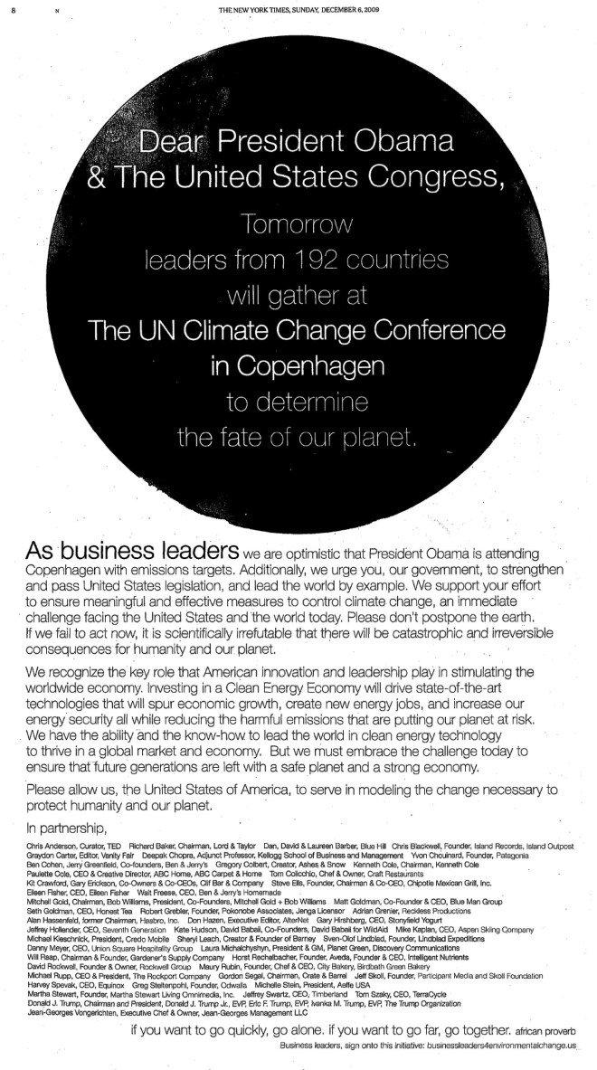
I have begun writing our leaders. Did you know that, in 2009, President Trump and three of his children signed an open letter to President Obama and the U.S. Congress asking for urgent action on Global Climate Change? It was in the New York Times. Here it is. Read it – I couldn’t have said it better myself! You’ll find Mr. Trump’s signature 2 rows from the bottom. I wrote to President Trump about that. In my district in Wisconsin, I am represented by two of the most vocal climate change deniers in the U.S. Congress. I wrote to them also. I am focusing my first batch of letters on a subject with which I have become informed: the overwhelming extent of scientific consensus that we have a real problem.
Please consider writing a letter or email to one of our leaders this week. On my Take Action page, I have posted resources to help you do that. I have also included copies of my own letters. Feel free to copy and paste if you agree with what I said. As I continue communicating with our leaders, I will keep posting my letters and any responses I receive.
But my letters won’t be enough. We need an avalanche of letters to wake up this frog! Please consider joining me this week. And please pass this call on to your friends.
Let’s RescueThatFrog together.

Glacier National Park, Montana, established in 1910, was named for the estimated 150 alpine glaciers that covered 21.6 square kilometers in the park around 1850. In 1979, the Earth was an average 0.45 degrees Celsius warmer and the glaciers covered 7.4 square kilometers. By 2010, there were only 25 glaciers left. A recent computer model predicts all glaciers in the park will vanish by 2030. Read more.
What shall we call Glacier National Park, when it contains no glaciers?
#AskYourDenierIfTheyveSeenThis
See more changes happening Before Our Eyes.
I’ve started a new page on rescuethatfrog.com, Before Our Eyes: Evidence of the changing Earth we can see. On it, I’ll be gathering together images from around the world that show how Global Climate Change is occurring right before our eyes.
Every image you see on this page will have been linked by scientists directly to human-caused global warming.

My opening addition to this page is the above <3 minute time lapse video (click on the image above), narrated by cryogenic scientist Dr. Walt Meier of NASA Goddard Space Flight Center, showing dramatic changes in the Arctic sea ice as captured by NASA satellite imagery from 1984 to 2016. Read more.
#AskYourDenierIfTheyveSeenThis


