“We have nearly 100 years worth of natural gas and more than 250 years worth of clean, beautiful coal. We are a top producer of petroleum and the number one producer of natural gas. We have so much more than we ever thought possible. We are really in the driving seat…” -President Trump, calling for loosening of environmental regulations in pursuit of a “golden era of American energy” in a June 29, 2017 speech promoting the White House’s “Energy Week”
“And the last administration had an idea of keeping it in the ground.” -EPA Administrator, Scott Pruitt, in a March 28, 2017 interview with ABC News Anchor, George Stephanopoulos
—–
Let’s ponder some numbers on those two statements. (Click hyperlinked numbers for more information…)
—–
According to the 2012 Global Energy Assessment, carbon content of estimated global recoverable fossil energy resources that remain, in gigatons of carbon: 15,000
According to the same assessment, range of estimated carbon content of remaining global reserves of “beautiful” coal (of which beauty is, I guess, in the eye of the beholder), in gigatons of carbon: 7,300 to 11,000
According to NASA scientists, based on climate modeling shown in a peer reviewed scientific analysis to produce excellent agreement with past known global conditions spanning hundreds of thousands of years of Earth’s history, expected global average temperature increase if we were to burn fossil fuels containing 10,000 gigatons of carbon on a “business as usual” trajectory from the present, in degrees Fahrenheit: 29
Over the Earth’s surface, current most common summer wet bulb temperature, degrees Fahrenheit: 80
In degrees Fahrenheit, sustained wet bulb temperature above which the human body cannot get rid of sufficient excess metabolic heat to maintain a normal core body temperature near 98.6 degrees Fahrenheit: 95
Assuming humanity burns additional fossil fuels containing 10,000 gigatons of carbon, estimated most common summer wet bulb temperature over the Earth’s surface, degrees Fahrenheit: 109
—–
“The Earth was 10-12°C [18-22°F] warmer than today … at the peak of the PETM [Palaeocene–Eocene Thermal Maximum, about 56 million years ago in Earth’s history]. How did mammals survive that warmth? Some mammals have higher internal temperatures than humans and there is evidence of evolution of surface-area-to-mass ratio to aid heat dissipation, for example transient dwarfing of mammals and even soil fauna during the PETM warming. However, human-made warming will occur in a few centuries, as opposed to several millennia in the PETM, thus providing little opportunity for evolutionary dwarfism to alleviate impacts of global warming. We conclude that the large climate change from burning all fossil fuels would threaten the biological health and survival of humanity, making policies that rely substantially on adaptation inadequate.
… Most of the remaining fossil fuel carbon is in coal and unconventional oil and gas. Thus, it seems, humanity stands at a fork in the road. As conventional oil and gas are depleted, will we move to carbon-free energy and efficiency—or to unconventional fossil fuels and coal? If fossil fuels were made to pay their costs to society, costs of pollution and climate change, carbon-free alternatives might supplant fossil fuels over a period of decades. However, if governments force the public to bear the external costs and even subsidize fossil fuels, carbon emissions are likely to continue to grow, with deleterious consequences for young people and future generations.
It seems implausible that humanity will not alter its energy course as consequences of burning all fossil fuels become clearer. Yet strong evidence about the dangers of human-made climate change have so far had little effect. Whether governments continue to be so foolhardy as to allow or encourage development of all fossil fuels may determine the fate of humanity.”
Using words including “mythical,” “hoax,” and “bullshit,” number of times Donald Trump tweeted climate change skepticism or denial between 2011 and 2015: 115
In a permit application filed by Trump International Golf Links Ireland, number of tons of rock proposed to make up a sea wall to protect Trump Doonbeg, a low-lying, sea-side luxury golf course and resort purchased by Trump in 2014, from “global warming and its effects” (wording from the permit application): 200,000
Proposed height, in feet, of Trump’s proposed sea wall, which Trump International Golf Links Ireland wrote is necessary in the permit application, directly citing climate change, because “it could reasonably be expected that the rate of sea level rise might become twice of that presently occurring”: 13
Number of offshore wind turbines proposed to be built 4 km from the same golf course by Clare Coastal Wind Power Ltd, which Trump International Golf Links Ireland formally opposed on the grounds that “the resort primarily relies on bookings from international and, in particular, the North American market and a reduction in bookings as a consequence of the visual impact from the proposed development will have a serious negative impact on tourism in the area”: 9
Approximate number of Americans who, for the time being, call Shishmaref home: 650
Including Shishmaref, Number of Alaskan towns and cities at imminent risk of destruction by the effects of climate change: 31
Dollar amount of a federal “climate resilience” grant, announced by the U.S. Department of Housing and Urban Development in January, 2016, to fund the relocation of approximately 60 residents of Isle de Jean Charles, Louisiana, which is similarly being destroyed by the effects of climate change, according to the National Climate Assessment, a report co-authored by 13 federal agencies: 48,000,000
Approximate number of residents of Kiribati, a nation of 33 Pacific islands that recently paid nearly $7 million for a 6,000-acre refuge in Fiji because climate models predict much of Kiribati will be underwater by 2100: 110,000
According to the International Organization for Migration, minimum number of people who passed through Agadez, Niger in 2016 while fleeing West Africa on the so-called “Road on Fire,” due to prolonged, climate change induced failure of their subsistence farms: 311,000
Since 1983, number of people the government of China has relocated from the arid Ningxia region into new, hastily built villages, due in large part to rising temperatures and diminishing rainfall in Ningxia linked to climate change, the most recent wave of whom China formally names “ecological migrants”: 1,140,000
Approximate rate of increase, in square miles per year, of China’s deserts due to human activities including climate change: 1,300
According to the United Nations Refugee Agency, average number of people “forcibly displaced by weather-related sudden onset hazards – such as floods, storms, wildfires, extreme temperature” each year since 2008: 21,500,000
Percentage contribution of U.S. to cumulative global CO2 emissions from 1850 to 2011: 27
U.S. rank among nations in cumulative global CO2 emissions from 1850 to 2011: 1
Number of nations that have signed the Paris climate agreement and maintain their intention to honor their voluntary commitments to it: 194
Number of nations, including the U.S., that have announced their intention not to participate in the Paris climate agreement: 3
Number of references to “climate change” in President Trump’s June 1, 2017 speech announcing his decision to withdraw the U.S. from the Paris climate agreement, an internationally negotiated agreement to work collectively to prevent the potentially catastrophic consequences of “climate change”: 0
Number of references to “innovation” or “technology” in President Trump’s June 1, 2017 speech announcing his decision to withdraw the U.S. from the Paris climate agreement: 0
Number of references to “solar” or “wind” in President Trump’s June 1, 2017 speech announcing his decision to withdraw the U.S. from the Paris climate agreement: 0
Number of references to “coal” in President Trump’s June 1, 2017 speech announcing his decision to withdraw the U.S. from the Paris climate agreement: 8
Number of references to “job,” “jobs,” or “joblessness” in President Trump’s June 1, 2017 speech announcing his decision to withdraw the U.S. from the Paris climate agreement: 18
Number of Americans employed by the coal industry in 2016, according to the DOE: 160,119
Number of Americans employed by the solar industry in 2016, according to the DOE: 373,807
Percentage of U.S. electricity generated by coal in 2016, according to the U.S. Energy Information Administration (EIA): 30.4
Percentage of U.S. electricity generated by solar in 2016, according to the U.S. EIA: 0.9
Number of Americans employed by the coal industry in 2016 per percentage unit of coal’s contribution to U.S. electricity generation: 5,267
Number of Americans employed by the solar industry in 2016 per percentage unit of solar’s contribution to U.S. electricity generation: 415,341
Metric tons of CO2 emitted in 2016 by electricity generation from U.S. coal, according to the U.S. EIA: 1,241
Amount of CO2 emitted by U.S. solar electricity generation: 0
—–
According to President Trump in a February, 2017 speech, estimate of potential jobs to be created by approval of the Keystone XL pipeline project, approved in March by the Trump Administration: 42,000
According to an official U.S. State Department report, number of permanent jobs expected to be created by the Keystone XL pipeline project: 35
According to a study by the DOE, percentage increase in CO2 emissions from Canadian oil sands oil, to be transported by the Keystone XL pipeline, relative to traditional U.S. crude: 18
Prior to the year 1850, average parts per million of carbon dioxide in Earth’s atmosphere over the past 800,000 years: 231
Prior to 1850, maximum parts per million of carbon dioxide in Earth’s atmosphere since the appearance on Earth of modern humans: 287
Parts per million of carbon dioxide in Earth’s atmosphere in 1850: 287
Parts per million of carbon dioxide in Earth’s atmosphere in 2016: 400.7
Global average increase in Earth’s surface temperature, in degrees Celsius, between 1850 and 2016: 1.2
In NASA’s temperature record since 1880, number of the warmest years on record that have occurred in the 19 years between 1998 and 2016: 17
Percentage reduction in September Arctic sea ice observed from 1979 to 2016, according to NASA: 34.4
According to NASA, current combined loss rate of land ice from Greenland and Antarctica, in metric tons per year, contributing directly to sea-level rise: 412,000,000,000
Global sea-level rise, in inches, between 1880 and 2014: 9
Temperature increase of Earth’s oceans since 1969, in degrees Celsius, according to NASA: 0.17
Percentage increase in acidity of the oceans since the Industrial Revolution, according to the National Oceanic and Atmospheric Administration: 30
Fraction of the Great Barrier Reef that suffered extreme damage from bleaching in 2016-2017, according to aerial surveys: 2/3
In 2007, photographer James Balog founded the Extreme Ice Survey (EIS), the most comprehensive ground-based photographic study of the Earth’s glaciers ever undertaken. Pioneering new automated time lapse technology, James and a team of scientists, videographers, and extreme weather expedition experts have setup 43 cameras to record the changes occurring in 24 glaciers in Antarctica, Greenland, Iceland, Alaska, Canada, Austria, and the Rocky Mountains. Over the past decade, this has resulted in stunning time lapse recordings of the changing glaciers (spoiler alert, they are melting). Click each of the images below to see, in about a minute, the effects of 7-8 years of climate change on one of the world’s largest glaciers.
Along with expansion of the oceans as they heat up, the melting of the large, land-based glaciers in these videos directly contributes to sea-level rise. A recent scientific study of the melting of Antarctic land-based glaciers, published in the prestigious and extensively peer-reviewed journal, Nature, makes the following conclusion:
“Antarctica has the potential to contribute more than a metre of sea-level rise by 2100 and more than 15 metres by 2500, if emissions continue unabated. In this case atmospheric warming will soon become the dominant driver of ice loss, but prolonged ocean warming will delay its recovery for thousands of years.”
The second of the above sentences refers to modeling results that quantified the expected effects of rising atmospheric temperature on the ocean temperature. The ocean heats up more slowly than the atmosphere. This means that atmospheric temperature changes we are “locking in” now will result in delayed warming of the oceans that will take millennia to reverse, even if we were to arrest the heating of the atmosphere now. This “sluggishness” of many of the Earth’s climate responses, very well understood by scientists, is important information for all of us to understand. As our leaders dither around with ignorant and disingenuous arguments about whether climate change is even happening (it is), balancing needs of the environment against short-term jobs in the fossil fuel industry (or, as evidence suggests is really the case, short-term profits for highly influential fossil fuel executives), we must understand that the decisions we are making right now, every day, are profoundly affecting the challenges of future generations, including the kids among us right now.
As you watch the videos below, imagine our children, and their children, and their children’s children, either erecting sea walls that will grow to 15 meter (49-foot!!) heights or abandoning our favorite coastal cities. Then, balance that against the potential for short-term job losses in the fossil fuel industry (keeping in mind that new jobs would presumably be created by the aggressive development of renewable energy). Destruction of our coastal cities and job losses in the fossil fuel industry are both economic harms, there is no doubt. Which is worse?
Video credit: EIS. Time lapse footage of the Mendenhall Glacier, Alaska, 2007-2015. EIS description: “The Mendenhall Glacier in Juneau, Alaska, has experienced significant retreat and deflation in the recent past. Once flowing proudly across Mendenhall Lake, the glacier now takes a small piece of lake front real-estate far from where our cameras were originally installed, and even further from the view of the thousands of visitors who travel to see the glacier each summer.”
Video credit: EIS. Time lapse footage of the Columbia Glacier, Alaska, 2007-2015. EIS description: “Flowing from the heart of the Chugach Mountains in South-Central Alaska, the Columbia Glacier is one of the fastest changing glaciers in North America. In the last 30 years the glacier has deflated well over one thousand feet and has retreated about ten miles. This loss contributes to approximately one percent of total sea level rise (accounting for both thermal expansion and glacier mass melt).”
Video credit: EIS. Time lapse footage of the Sólheimajökull Glacier, Iceland, 2007-2015. EIS description: “The Sólheimajökull Glacier is a large tongue of ice that flows southward off of the Mýrdalsjökull Ice Cap in Southern Iceland. The glacier is retreating due to a combination of stream erosion and ice melt. The cracks or “crevasses” that can be seen forming parallel to the flow of the glacier indicate that it is spreading out and thinning as it continues to flow forward.”
Video credit: EIS. Ilulissat Glacier, Greenland, 2007-2014. EIS description: “The Ilulissat Glacier in Western Greenland is one of the fastest flowing glaciers in the World and contributes more ice to the World Ocean than any other glacier in the Northern Hemisphere. On May 28, 2008, Adam LeWinter and Director Jeff Orlowski filmed a historic breakup at the Illulissat Glacier. The event lasted for 75 minutes during which the three mile wide terminus of the glacier retreated a full mile. This rare footage has gone on record as the largest glacier calving event ever captured on film, by the 2016 Guinness Book of World Records.”
Image credits: NASA. A crack in the Antarctic Larsen C ice shelf as imaged in November, 2016.
Showing both events on a split screen would’ve made for some good TV.
The photos above, of a crack in the Antarctic Larsen C ice shelf, were taken last November. But throughout last week, scientists watched as the greater than 120-mile long crack advanced 11 miles, leaving the crack tip only 8 miles from the edge of the ice shelf. This chunk of the ice shelf is expected to break off soon, freeing an iceberg roughly the size of the state of Delaware.
Image credit: CNN. Progress of the crack in the Antarctic Larsen C ice shelf.
“…by 2040, compliance with the commitments put into place by the previous administration would cut production for the following sectors: … coal – and I happen to love the coal miners – down 86 percent.” -President Trump, explaining in the Rose Garden a shocking prediction that informed his thinking on exiting the Paris Climate Agreement
Um, duh. Replacement of CO2-emitting fuel sources with renewable ones is, literally, the point of the Paris Climate Agreement. So, yeah, parties to the agreement will be burning less coal. On account of trying to prevent the flooding described above, among other terrible consequences predicted if we continue “business as usual.”
A partial list of other industries that have succumbed to the relentless march of progress: horse and buggy manufacturing; rotary dial phone manufacturing; typewriter manufacturing; Betamax, VHS, 8-track, and cassette tape manufacturing; vinyl records; floppy discs; phone booths; dial-up modems; parachute pants (at least, until they come back); cathode ray tube televisions.
Does President Trump weep for the disappearance of those obsolete industries, each of which previously employed Americans? Most of us don’t weep, because those industries have all been replaced by new ones, to everyone’s benefit. Coal is no different. It’s served a valuable purpose, enabling much of the world to industrialize. But now we have economical solar energy, and it’s better.
The single part of Trump’s speech that had merit was his concern for workers in the coal industry, who are suffering from diminishing employment opportunities. As it turns out, this has very little to do with the Paris Climate Agreement, however. As has been widely reported (link, link, link), coal jobs are disappearing primarily due to automation (human coal miners get black lung; machines don’t), cheap natural gas, and cheap renewables. So, in the case of this one meritorious element of Trump’s argument, he has prescribed the wrong medicine for the right diagnosis. It may make some people feel good when they watch him on TV, but it’s not going to work, and in literally giving the entire Earth a fever, it has some serious side effects.
If Trump really cares about coal miners, one can envision productive policies that might actually help them. For example, upgrades to the U.S. electrical grid can help utilize renewable energy sources more efficiently (easy-to-read article, scientific study). The President’s $1 trillion infrastructure plan could include some of these upgrades, with a provision to re-train coal miners to do the work.
In an impressive feat of linguistics, President Trump managed to deliver his 2,000 word speech about exiting the Paris Climate Agreement, an agreement directed at preventing the worst potential consequences of climate change, without even once mentioning, well, climate change. EPA administrator Scott Pruitt, in a follow-up interview, further clarified this:
“This is not about whether climate change is occurring or not.” -Scott Pruitt, head of a federal agency with “environmental protection” in its name, clarifying his takeaways from the President’s statement Thursday announcing plans to withdraw the U.S. from the cooperative international effort to protect the environment from climate change, which is occurring
If climate change is occurring (it demonstrably is), then its terrifying potential consequences – destruction of the Palm Beach Mar-a-Lago, followed by an existential threat to the survivability of humans on Earth – would surely outweigh any of the purely short-term economic harms Trump mentioned in his speech. So, of course, this is precisely about whether climate change is occurring or not.
With respect to climate change, our federal government is failing us. The executive branch has just aligned us with Nicaragua and Syria in some sort of Axis of Environmental Villainy, spouting nonsensical declarations about climate change along the way (that it’s a hoax, it’s not happening, the science is “not in,” etc.) But Congress is entirely complicit. As I documented on another page, the attitudes of Congress members with regard to climate change fail to reflect those of the general public, let alone the scientists whose attitudes have been informed by actual data. The Supreme Court largely put Congress up for sale with its Citizens United decision. By equating monetary contributions with “speech,” this decision handed a virtually infinitely sized bullhorn to any corporate interest with deep pockets, an unimaginative business plan, and a callous disregard for future humans. As described in this New York Times article, Koch Industries and other fossil fuel interests have used this to great effect, systematically funding successful primary challenges to Congress members expressing concern about climate change, among other activities.
Here’s the thing, though. The Earth doesn’t care. As long as we continue “business as usual,” ice chunks equated with the sizes of ever larger U.S. states will continue breaking off of Antarctica and Greenland. This will happen whether Trump talks about it or refuses to talk about it, whether the EPA has a global warming website or not, or whether Trump is successful in his efforts to de-fund the very science activities with which we observe the climate.
A group of people – any group of people, including the President’s administration – who remains too thoroughly and too long divorced from reality will inevitably become irrelevant, because truth will eventually show them to be ridiculous. If an ice shelf collapses in Antarctica and no scientists are funded to see it, does it make a sound? Yes. Eventually, the sound of waves lapping at the base of the Mar-a-Lago.
The silver lining in all this, for me, is it has been a powerful civics reminder of the wisdom of our Founding Fathers, who created a federalist government replete with checks and balances, not only at the federal level, but between the various levels of government themselves. In the event that the federal government goes off the rails, states and cities retain substantial independence and power. In the wake of Trump’s shameful and irresponsible announcement of his administration’s withdrawal from the Paris Climate Agreement, the following events have unfolded:
In response to the part of Trump’s speech in which he explained his shameful decision by saying he was “elected to represent the citizens of Pittsburgh, not Paris,” the mayor of Pittsburgh tweeted, “As the Mayor of Pittsburgh, I can assure you that we will follow the guidelines of the Paris Agreement for our people, our economy & future.”
The governors of New York, California, and Washington announced the formation of the United States Climate Alliance to convene states that will uphold the commitments of the Paris Agreement no matter what the federal government does (read more). Together, these states are the 5th largest economy and the 6th largest carbon emitter in the world.
The mayors of over 85 U.S. cities signed a letter making a similar commitment.
Many of America’s most innovative corporations also expressed their intention to support the Paris Agreement.
While the federal government could (and should) certainly help, the fact is, in our federalist nation, it need not define us. If a sufficient number of states, cities, and corporations only want to buy renewable energy, then fossil energy will go the way of Betamax.
I started this blog because I was worried the events of last Thursday might unfold. They unfolded. Now, we need to shift our attention and support to the leaders who remain engaged with reality. Being as informed as possible is an important part of that.
This is the 7th episode in a series recounting the history of measurements and data related to Global Climate Change. If you’re just joining, you can catch up on the previous episodes:
Episode 1: Beginnings (or two British scientists’ adventures with leaves and CO2 measurements)
Episode 2: First measurement of anthropogenic global warming
In the last 3 episodes of our history of global climate change evidence, we’ve focused on measurement of Earth’s atmospheric CO2 record, finding in the last episode that it’s now over 40% higher than the entire pre-industrial experience of the human species spanning over 200,000 years. But we have not checked in on global temperature measurements since Episode 3, where the intrepid steam engineer, Guy Callendar (1961) and Landsberg & Mitchell, Jr. (1961) had independently measured what appeared to be a slight but discernible warming between 1880 and the late 1950’s. You may also recall from Episode 3 that the physicist, Gilbert Plass, had used some of the first computers to refine calculations of infrared absorption by CO2, predicting we would observe about a 1 degree temperature increase between the years 1900 and 2000, whereupon we would also begin to observe obvious effects of climate change.
Well, the year 2000 has come and gone and we have thermometers all over the world. Let’s grade Dr. Plass’ work, shall we?
In the 1960’s and 1970’s, others continued to document surface temperature records from collections of meteorological stations, but the data were gathered primarily from stations in the Northern Hemisphere and there wasn’t a standardized method of obtaining a truly global temperature average. During that time, James Hansen, a physicist and astronomer at the NASA Goddard Institute for Space Studies, was studying the planet Venus. Specifically, he was calculating the influence of Venus’ thick atmosphere on its extremely hot surface temperature. (Fun fact: scientists believe Venus’ atmosphere several billion years ago was similar to Earth’s and it had liquid water on its surface, but Venus now has a thick atmosphere and a scorching surface temperature of 864 degrees Fahrenheit due to the occurrence of a runaway greenhouse effect.)
In the late 1970’s, Hansen turned his attention to similar calculations of the effects of Earth’s atmosphere on its surface temperature. As part of this work, he tackled the problem of creating a standardized method for calculating global average temperature trends. The method begins with the recognition that, while absolute temperatures are widely variable from place to place on the Earth, even for locations relatively close to one another, temperature changes of nearby locations tend to be very similar. For example, while the absolute temperatures in New York and Pittsburgh might be quite different on a particular day, if one is having a hotter than average month, the other is likely having a month hotter than average by around the same amount. Thus, global temperature trends are plotted, not as absolute temperatures, but as temperature differences, called “temperature anomalies,” relative to some reference temperature.
The second key element of the method is the Earth’s surface is divided up into a grid formed by squares of equally spaced latitude and longitude lines, such that each square contains a sufficient number of weather stations to obtain an accurate record of historical temperature data. At any given time in history, then, the temperatures of the squares are averaged to get an estimate of the global average temperature. Various statistical methods are used to correct for errors, such as the known artificial urban warming around weather stations in or near cities. The gathering of sufficient, widespread temperature data to apply this method began in the late 1800’s. Hansen’s method was initially published in the peer-reviewed scientific journal, Science, in 1981, and has since been updated as the techniques have continued to improve (1987, 2010).
Similar methods have now been applied independently by four major research groups. They make their data publicly available for download (see links in the caption below). Here are the four readings of the “global thermometer” (orange, pink, red, and purple lines) plotted on top of the global CO2 record (green and blue circles) we saw in Episode 5:
Due to differences between the chosen data sources, gridding methods, and error correction methods used by the four independent groups (for details, see references in the caption above), the four temperature records are not identical. They show remarkable agreement, however. They generally have peaks and valleys in the same places, and their basic conclusions are all the same – the world is about 1.1 degrees Celsius warmer now than it was in pre-industrial times. Check out the video below, where the NASA and NOAA gridded data have been used to show how different parts of the globe have changed in temperature.
Video credit: NASA Goddard Space Flight Center (link to web page). Video using a color coding of NASA and NOAA gridded global temperature anomaly data to show how the Earth’s temperature has changed since 1880.
There is no obvious evidence of a “Chinese hoax” here. Instead, these appear to be the serious, well considered and extensively peer-reviewed conclusions of four independently funded and well-respected scientific groups (a British group, a Japanese group, and 2 U.S. groups – one of which, NASA, has brought us other generally well-regarded scientific achievements such as the moon landings).
In their 1981 paper, James Hansen and his coworkers calculated the temperature increase, relative to the global temperature around 1975, at which we would have a greater than 98% statistical confidence that global warming is “real” (not just a result of random temperature variations). That would be when the temperature rose above the light grey range in this graph, about 0.2 degrees C higher than the 1975 temperature, which the NASA scientists predicted would occur in the 1990’s.
Figure 7 from Hansen, et al. (1981). Calculation of the temperature change, relative to the temperature in the late 1970’s, at which our statistical confidence that global warming had exceeded previous natural variation would reach >85% confidence (represented by the dark grey range) and >98% (light grey range).
A look at the temperature data above shows that had indeed occurred by the 1990’s. Now, we are a full 0.8-1.0 degrees C above the 1975 temperature, and there can really be no doubt.
Strikingly, the temperature graphs above have almost exactly the same shape as the CO2 graph! But, if we’ve been paying attention to our history of evidence, this should not be a surprise. Rather, it should be a confirmation of our expectations. Sure, the Earth’s climate is a highly complex system, and there have been real questions about things like the role of the deep oceans, as we saw in Episode 3. But those questions were settled by around 1960, by which time Dave Keeling had also begun direct measurements of the atmospheric CO2 concentration. Once we see CO2 going up, we expect warming with mathematical certainty. Based on physics known since the early 1800’s, CO2 absorbs infrared radiation reflected from the Earth’s surface, generating heat. It’s as simple as that. At the end of the day, the basic physics driving global warming are far simpler than those at work every moment inside your smart phone.
Anyone denying the reality of global warming would have to not only explain why at least four formidable groups of well-respected scientists, not evidently influenced by Chinese hoaxters, don’t know how to process data from thermometers. They would also need to explain how the undeniable increase in atmospheric CO2 through the combustion of fossil fuels has somehow not resulted in warming, when anyone with a basic laboratory infrared instrument can verify the infrared absorption of CO2. In fact, did you notice in Episode 4 how the weekly atmospheric CO2 concentration at Mauna Loa is measured? By the infrared absorption of collected air samples! So, every time we measure the CO2 concentration of the atmosphere, by the method precise enough to reveal the seasonal respiration of plants, we verify the very physical phenomenon that drives global warming!
OK, so it’s time to grade Dr. Gilbert Plass’ 1956 prediction of around 1 degree Celsius of warming between 1900 and 2000, and readily observed effects of global climate change, due to infrared adsorption by increased atmospheric CO2. The verdict?
Actual warming between 1900 and 2000? Around 0.8 degrees C. Not bad. Maybe an A-. But pretty impressive given that Dr. Plass was using the world’s very first computers and considering only the effects of infrared absorption by CO2.
Readily observable effects of global climate change? Absolutely.
Click below to watch a 5-minute video of the largest glacier collapse ever caught on film, according to the 2016 Guiness Book of World Records.
On May 28, 2008, while setting up to capture time-lapse footage of the Ilulissat Glacier (also known as the Jakobshavn Glacier) in western Greenland, documentary filmmakers Adam LeWinter and Jeff Orlowski happened to be in the right place, at the right time, to capture on film a 75-minute calving event during which a chunk of ice roughly the size of Manhattan broke off the glacier and collapsed into the ocean, causing a virtually instantaneous one-mile retreat of this Greenland glacier.
The filmmakers’ footage of glacier changes in the Arctic, due to global warming, was ultimately part of a documentary film, Chasing Ice, which won an Emmy in 2014. (You can stream it on Netflix.)
In 2015, the same glacier lost another 5 square mile chunk of ice during a 2-day period in August. Its current melting rate is roughly three times its melting rate in the 1990’s, according to a scientific study published in 2014. The Greenland ice sheet is dumping about 300 gigatons of ice into the ocean each year, according to NASA, making it the current largest source of sea-level rise from melting ice.
Image credit: Matt Amesbury as reported by CNN and The Washington Post. Photo altered by me.
A ruggedly verdant scene. A lonely, mossy, wind-swept shore battered by white caps. Where in the world do you think it is? A craggy coastline of Ireland, perhaps?
Confession time: I (inexpertly) altered the photograph above. Here’s the original one:
Image credit: Matt Amesbury. Original photograph as reported by CNN and The Washington Post.
Those aren’t white caps. They’re icebergs.
Now, where do you think we are?
The western peninsula of Antarctica. Seem unnatural? If you think so, you’re right. At least, it’s unnatural compared with a similar photo that might have been taken 50 years ago or before that, which would have shown “a monochrome shot of ice.” That’s according to Dominic Hodgson, co-author of a new study of “moss cores” published in the scientific journal Current Biology.
Warming temperatures and dwindling ice, resulting from global climate change, are causing a “greening” of the western peninsula of Antarctica, where the study of a 150-year record of “moss cores” from 3 separate areas of the peninsula shows moss coverage has increased by “4 or 5 times” over the past 50 years. This creates risks of unpredictable ecological changes in Antarctica, for example, due to the growth of invasive plant species that could potentially spread there.
The greening of Antarctica parallels similar findings in the warming Arctic, where it may actually be occurring faster.
In case you haven’t seen them in the news, you may wish to be informed about a number of recent developments related to our shared ability to apply scientific knowledge and reasoning to our public polices, including those related to climate change. I’d also like to share a couple quick things you can do to show our leaders you are paying attention and you care. If you are reading this, you likely care enough to take 5 minutes of action this weekend (see bottom of this post).
THE MYSTERIOUS CASE OF THE EPA’S DISAPPEARING CLIMATE CHANGE WEBSITES
According to its archiving rules, EPA makes the January snapshot of the website available on its new “This page is being updated” page. However, it will not be updated and some critical links do not work. For example, as reported by The Washington Post, a popular youth-focused educational resource on climate change, comprising over 50 pages, is no longer accessible from either the archived snapshot page or the EPA’s main pages. In fact, it has become very difficult to find even using Google. As a public service, I’ll make it available here (as long as it remains in existence), so you can see exactly what scientific, EPA-developed content certain of our leaders evidently no longer want our kids to see: A Student’s Guide to Global Climate Change.
Screen shot of the buried EPA educational website, A Student’s Guide to Global Climate Change, no longer accessible from EPA’s main pages, former climate change page (now archived), or through a casual Google search. Educational items like “Learn the Basics,” “See the Impacts,” “Think Like a Scientist,” and “Be Part of the Solution!” are evidently no longer considered desirable youth reading material by the EPA. Your tax dollars paid for this content!
Here are excerpts from the EPA’s May 28 press release regarding the updating of its web-based materials related to climate change:
Do you smell something? It’s smoke, because this is the modern equivalent of burning books. Of course, the above signals the Administration’s intention to weaken or destroy the Clean Power Plan, our government’s current primary policy vehicle for complying with our commitments under the Paris Climate Agreement. But what should these policy deliberations have to do with the availability of educational content your tax dollars paid the EPA to develop about the scientifically proven facts related to climate change? Nothing, that’s what.
For more information, see the website of the Environmental Data & Governance Initiative, a group that has been tracking changes to public science and environmental sites.
REMOVAL OF SCIENTISTS FROM THE EPA BOARD OF SCIENTIFIC COUNSELORS (BOSC)
On April 30, the EPA dismissed about half of an 18-member scientific board. The function of the board is to provide independent peer review of the work of EPA scientists to help ensure EPA policies are underpinned by sufficiently rigorous scientific findings. According to an agenda of an April meeting of the board, among the topics discussed was, “the growing need for information on, and understanding of, climate change and responses to its impacts.”
The board is filled primarily with academic scientists who may serve two 3-year terms, their tenure after the first term having almost always been renewed. On April 30, scientists up for renewal were informed they had been dismissed. J. P. Freire, a spokesman for EPA administrator Scott Pruitt, said, “The administrator believes we should have people on this board who understand the impact of regulations on the regulated community,” and indicated he would consider replacing the dismissed academic scientists with industry representatives whose very industries the EPA regulates.
More changes at the EPA are almost certainly in the works. This fall, over a third of a larger and more important 45-member EPA Science Advisory Board are up for renewal. As reported in the Washington Post, a budget for that panel slates it for an 84% cut for 2018, citing “an anticipated lower number of peer reviews.” (Of course, peer reviews happen to be the primary way scientists ensure the continued integrity of science.)
SUSPENSION OF SCIENCE ADVISORY BOARDS BY THE DEPARTMENT OF THE INTERIOR
Secretary of the Interior, Ryan Zinke, ordered on May 5 a freeze of the work of over 200 advisory boards, committees, and subcommittees that advise the Department on issues ranging from invasive species to threats and impacts from climate change. About a third of these bodies were reported to be science-based.
OPPORTUNITY FOR ACTION: EPA REQUEST FOR PUBLIC COMMENTS DUE MAY 15
On February 24, President Trump signed Executive Order 13777, directing federal agencies to setup a Regulatory Reform Task Force to evaluate existing regulations and make recommendations about potential repeal, replacement, or modification to “alleviate unnecessary regulatory burdens.” Pursuant to that Order, the EPA is seeking public comments as part of its Evaluation of Existing Regulations. If you think we should keep existing regulations (like the Clean Power Plan) intended to empower EPA to create incentives for the adoption of carbon-free energy technologies and enable us to participate meaningfully in the 2016 Paris Climate Agreement, please take a couple minutes to make a comment. All comments must be submitted by next Monday, May 15.
Next to “Evaluation of Existing Regulations,” click on “Comment Now!”
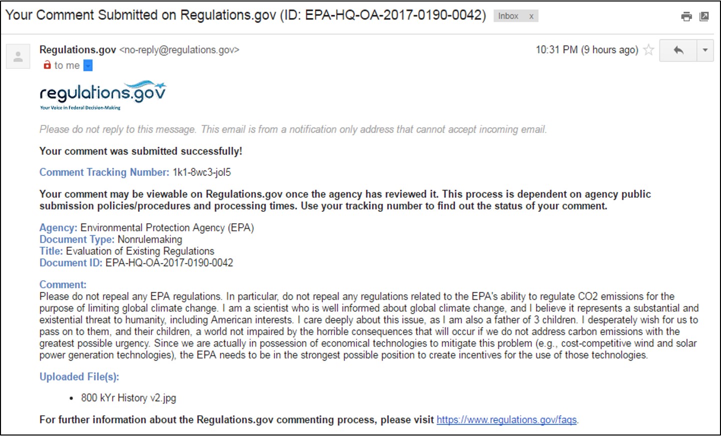
Your comments can be short – even one sentence. Here is what I submitted: JPG.
OPPORTUNITY FOR ACTION: TRUMP ADMINISTRATION DELIBERATIONS AND UPCOMING ANNOUNCEMENT ABOUT THE PARIS CLIMATE AGREEMENT
The Trump Administration has reportedly been deliberating about whether to withdraw from or weaken the United States’ CO2 emission reduction targets under the Paris Climate Agreement. (Read more.) If you have been following any of the science-based content of rescuethatfrog.com, I hope you are convinced that withdrawal from the Paris Climate Agreement by the United States would be a disaster for all of us not exclusively interested in the short-term profits of the fossil fuel industry. Likewise, weakening our targets would be shameful and dangerous. The consensus among scientists is the Paris Climate Agreement is both our best hope and inadequate, as it is, to avert substantial environmental damage from global climate change. (Read more in the MIT Technology Review.)
Here is a letter I wrote to the President yesterday about these deliberations: Word, PDF.
Please consider taking a few minutes to write a letter or email of your own. To email, go to this website: https://www.whitehouse.gov/contact.
The Administration has signaled its intention to announce a decision soon.


